DATA VISUALIZATION · 2025
ICOC Admin Map Dashboard
Solo freelance delivery of a Leaflet-based choropleth dashboard for an internal lab network — from requirements gathering through geographic data normalization, batched Firestore aggregation, and client handoff.
1
PERSON TEAM
Leaflet
MAPPING ENGINE
6
GEOJSON SOURCES MERGED
2025
DELIVERED
MY CONTRIBUTION
Requirements & Scoping
Led
UI / UX Design
Led
Frontend Development
Led
Backend / Firestore Data Layer
Led
Client Communication
Led
BEFORE / AFTER
BEFORE
No existing tool. Administrative staff tracked lab locations, chain-of-custody (COC) records, and sample counts by working directly in spreadsheets — no spatial view, no drill-down from country to state, no way to see where COC volume was concentrated.
AFTER
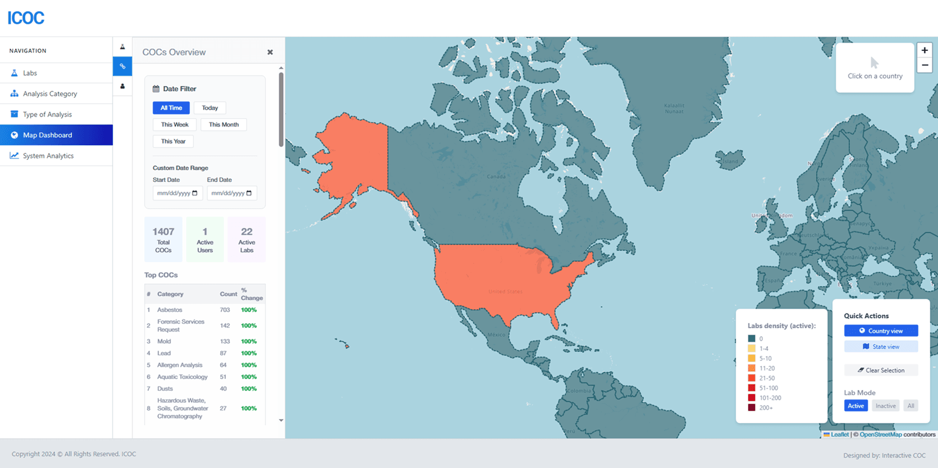
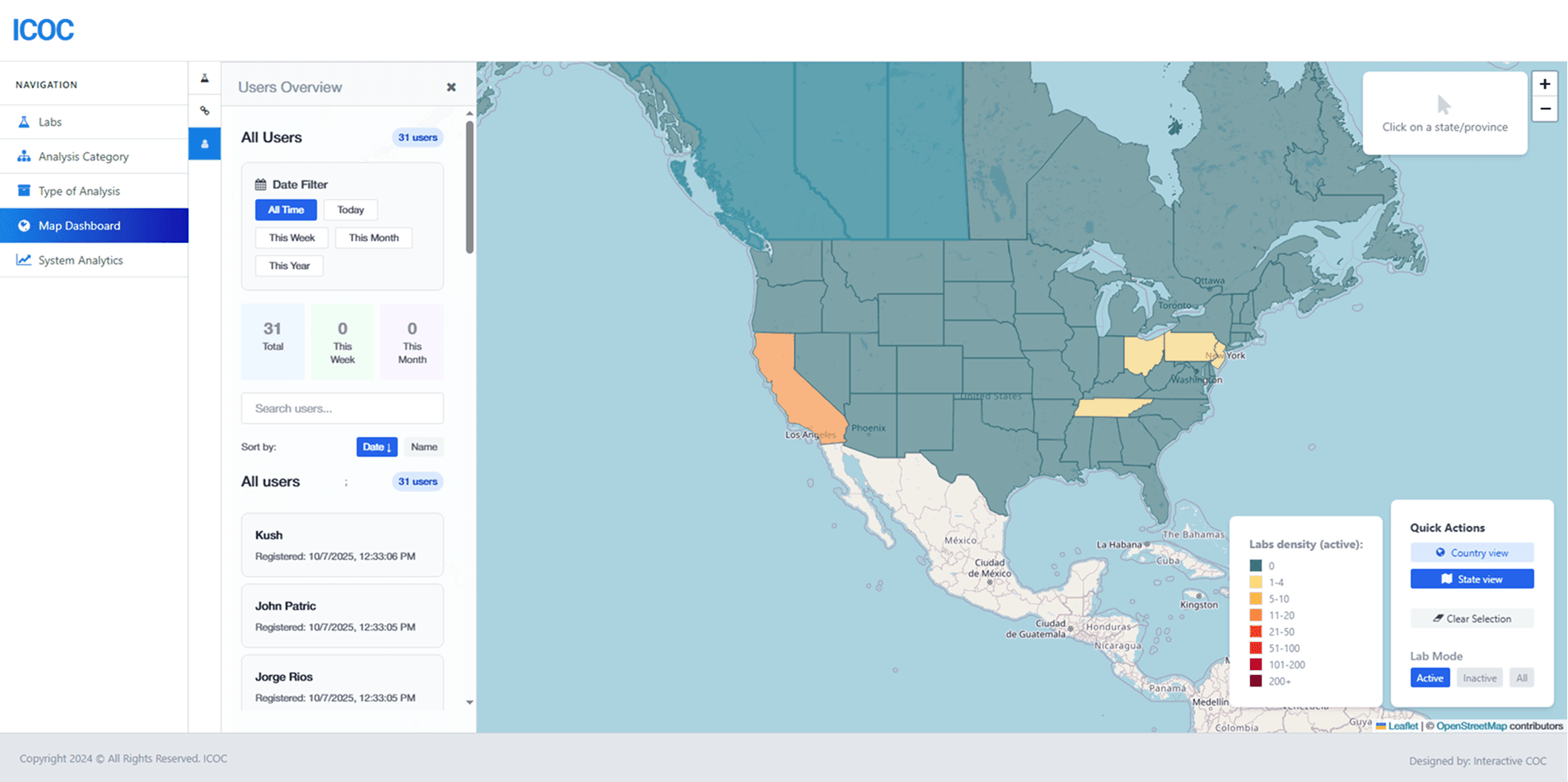
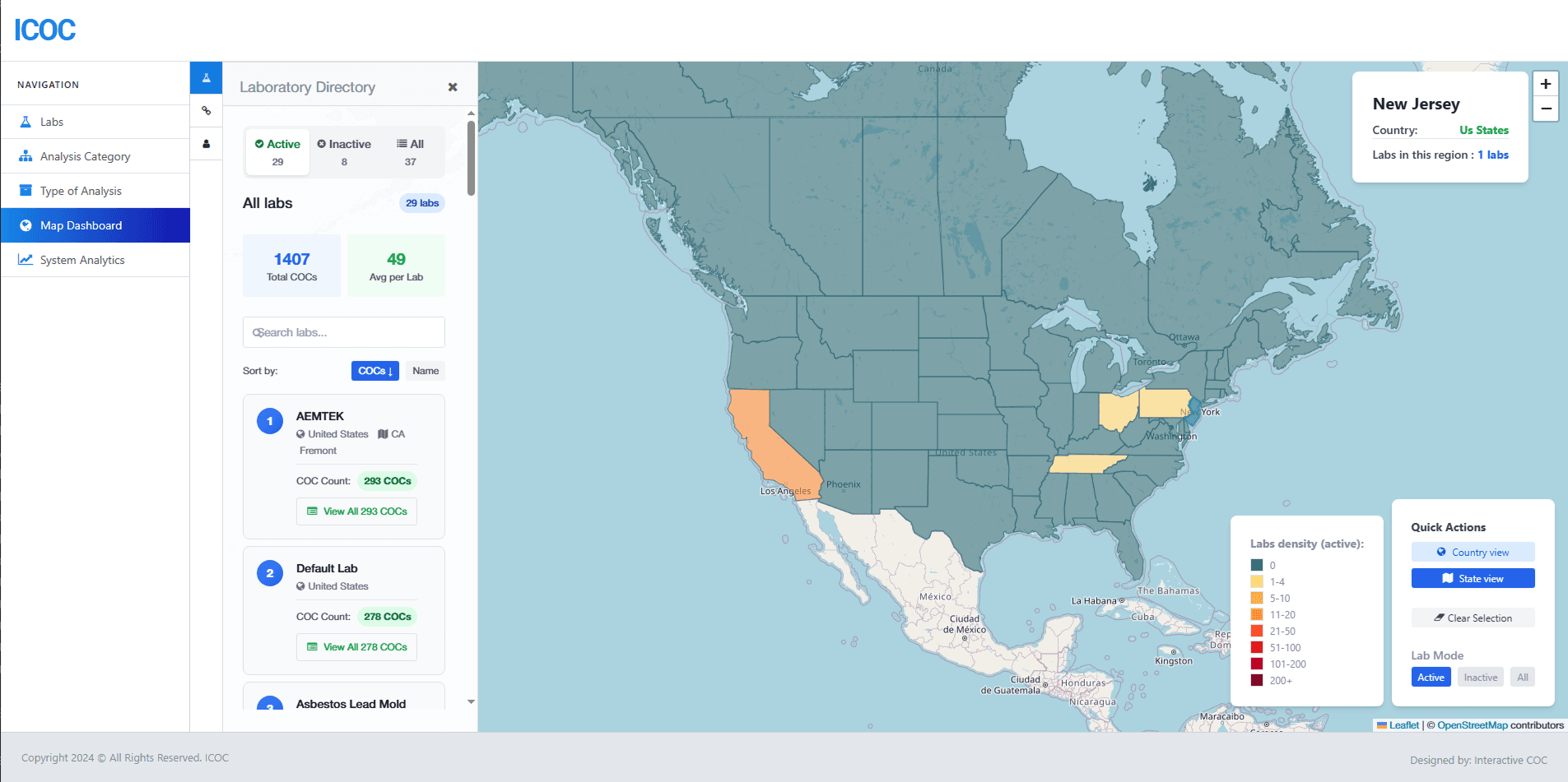
Interactive Leaflet choropleth with country- and state/province-level drill-down, lab/COC/user directories filterable by region and status, and a classed density scale tuned separately for active vs. inactive labs. Delivered solo end-to-end; client onboarded independently after a single handoff session.
CONTENTS
01 BACKGROUND
02 MY ROLE
Background
ICOC needed an internal tool for seeing where its lab network was concentrated and managing the records tied to each location — chain-of-custody paperwork (COCs) linking samples to labs, and the admin users generating them. None of that existed as a system before this: staff answered questions like "how many active labs do we have in Texas" or "where is COC volume concentrated this month" by filtering spreadsheets by hand. There was no spatial view and no drill-down path from a world view down to a single lab. This was a greenfield build with nothing to inherit, and I was the only person on it — brought in to gather requirements directly from the client and then own everything through delivery.
My Role
I handled every part of this: the initial requirements conversations, information architecture, UI design, the Firestore data layer, frontend development, testing, and the handoff documentation the client used to onboard independently afterward. There was no backend engineer to hand data-shape questions to and no designer to review a mockup against — every decision, including less visible ones like how to reconcile inconsistent geographic name data, was mine to make and live with.
Leaflet + react-leaflet over Mapbox GL JS
DECISION
Chose Leaflet, via react-leaflet, rendering OpenStreetMap raster tiles — over Mapbox GL JS as the mapping engine.
REASONING
The dataset was a few hundred country and state/province polygons, not a large point cloud — nowhere near the scale where Mapbox's WebGL renderer earns its complexity budget. react-leaflet's <GeoJSON> component takes a plain style(feature) callback, which matched how the choropleth's color logic was already written as a function of feature.properties.labCount. Mapbox GL JS would have added an API key, a usage-billed account, and a style-spec learning curve to an internal tool with no ongoing platform budget and one maintainer after handoff. Leaflet was the boring, correct choice at this polygon count.
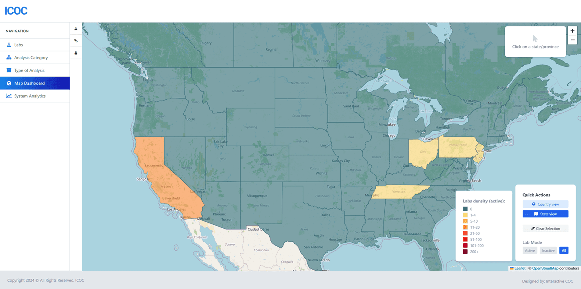
FIG. 02 — Project overview
CONTENTS
03 CLASSIFYING A SKEWED DISTRIBUTION
04 MERGING SIX BOUNDARY SOURCES
05 BATCHED FIRESTORE AGGREGATION
06 INTERACTION DESIGN AT THE LAYER LEVEL
07 OUTCOME
08 LESSONS LEARNED
Classifying a Skewed Distribution
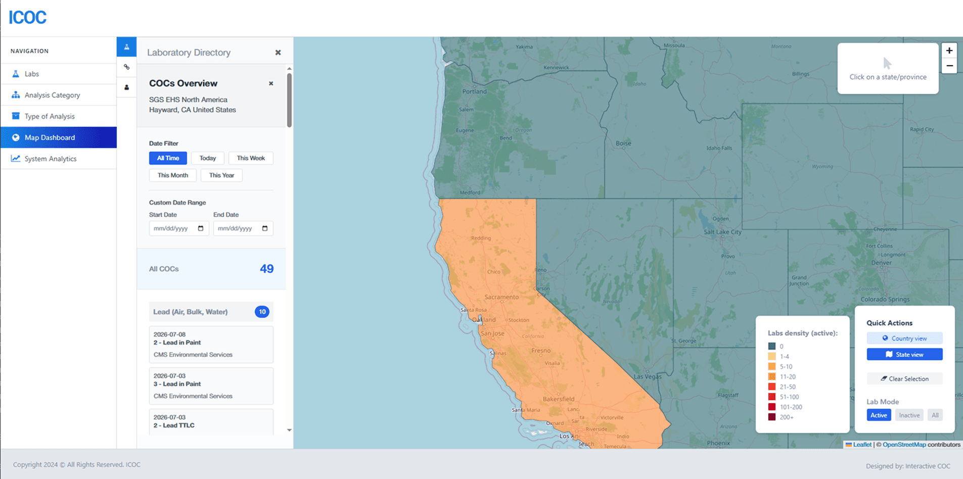
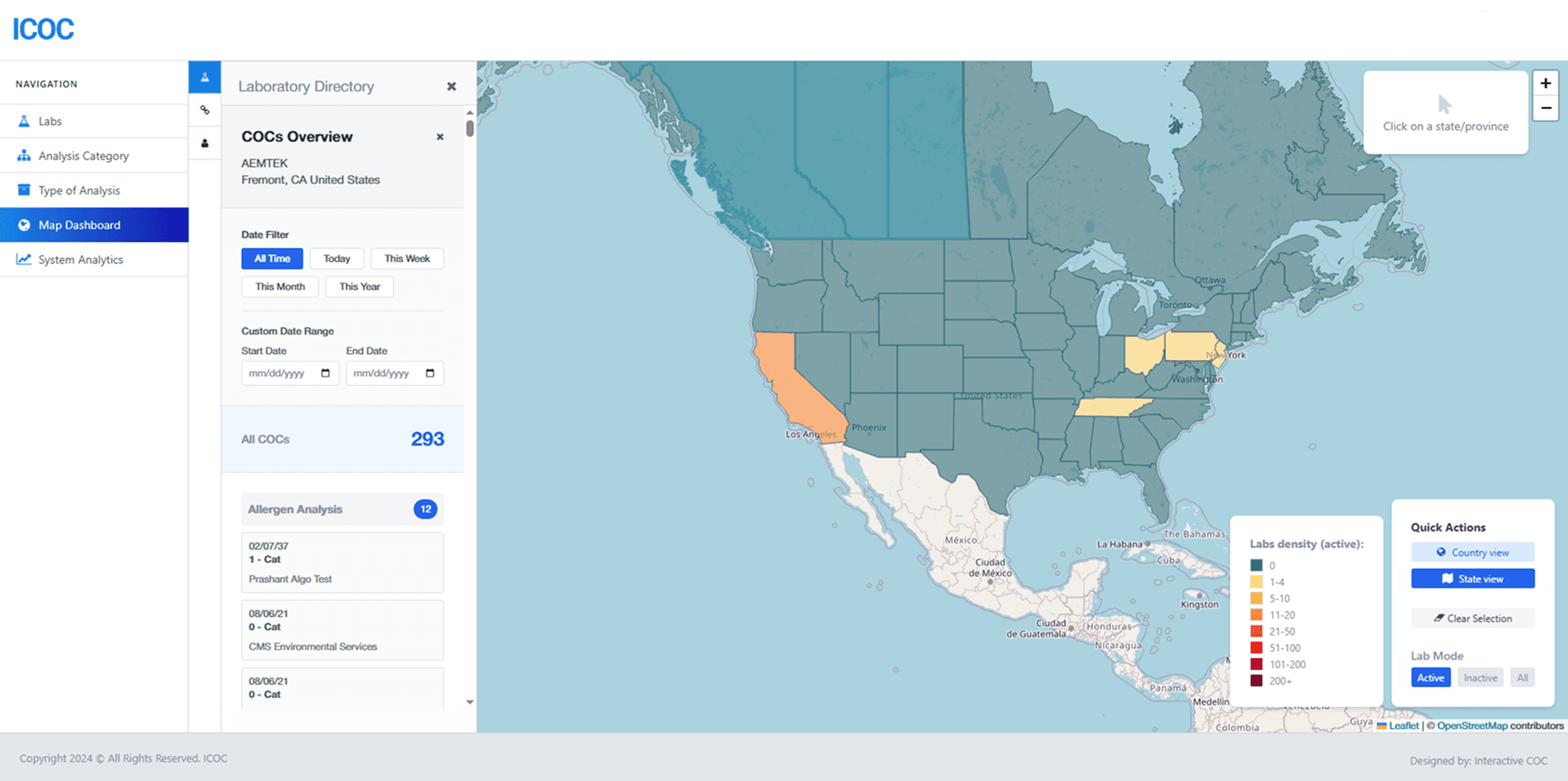
The map's shading comes down to one function: bucket a region's lab count into one of eight colors. That's trivial to say and easy to get wrong, because the actual distribution is heavily skewed — most countries have zero labs, a handful have a couple dozen, and one or two outliers have 200+. An equal-interval scale (eight buckets spanning 0–200 in steps of 25) would put nearly every region in the bottom bucket and tell you nothing. Instead I hand-tuned the break points to the real shape of the data: 0, 1–4, 5–10, 11–20, 21–50, 51–100, 101–200, 200+. Each step roughly doubles or more — the same instinct behind quantile or natural-breaks (Jenks) classification in GIS tooling, just tuned by eye against the real export instead of computed by an algorithm, since the dataset was small and stable enough that eyeballing it was faster and more legible than wiring up a classification library. The thresholds also aren't fixed. Active and inactive labs have very different volume profiles — inactive lab counts per region run much lower across the board — so reusing the active thresholds for the inactive view would collapse almost everything into the bottom bucket. The color function takes a labMode argument and swaps in a lower threshold set for inactive labs, so the same eight-color ramp stays legible no matter which subset of labs the admin is looking at.
Merging Six Boundary Sources
Country-level view is one world GeoJSON file. State/province-level view isn't — it's six separate boundary files stitched into one FeatureCollection at runtime: US states, Canadian provinces, and four separate UK constituent-country files, since England, Scotland, Wales, and Ireland each ship their own provinces geometry. Those fetch in parallel, get tagged with a sourceCountry property so the sidebar can show which country a given province belongs to when you drill in, and get concatenated into a single feature array that Leaflet renders as one layer. The harder problem sits underneath that: matching those polygons back to Firestore data. Lab records store labCountry and labState as free-text strings admin staff typed in over time — "USA," "US," and "United States" all mean the same country; state abbreviations, older postal abbreviations ("Calif," "Ariz," "N.C."), and full names all show up for the same place. GeoJSON boundary files use one canonical name per region. I built two lookup tables — one for countries, one covering all 50 states plus DC and the territories — that normalize every variant I found to the GeoJSON's canonical spelling before grouping labs by region. Because that mapping table is necessarily incomplete — new variants show up as staff enter new labs — I also wrote a small debug utility that diffs the set of region names coming out of Firestore against the set of names in the boundary files and logs anything left unmatched. It isn't client-facing; it's a tool I run against the data to catch a new "Massachusetts" vs. "Mass." mismatch before it silently shows up as a region with zero labs on the map.
Batched Firestore Aggregation
The map's numbers come out of a three-level join — Labs → COCs → Samples — done entirely client-side, since this stack has no server-side aggregation queries available. For each lab I need a COC count; for each COC I need a sample count; both have to be batched intelligently or the dashboard makes hundreds of round trips on load. Firestore's 'in' query operator caps out at 10 values per query. With lab and COC ID lists running well past that, I chunk each list into batches of 10, fire all the batches concurrently with Promise.all, and merge the per-batch results back into one lookup map keyed by ID. It's the same pattern in both the lab → COC count function and the COC → sample count function — a hard platform ceiling turned into a batched-parallel fetch instead of a serial loop. The COC dataset also gets a session-scoped cache, keyed with a version string, so that if I change the shape of what gets cached, old cached entries from a previous session are simply ignored instead of causing a shape mismatch downstream.
Interaction Design at the Layer Level
React re-rendering an entire GeoJSON layer on every mouse move would be slow and visually janky — Leaflet layers are imperative objects, not React state. So hover and click bypass React's render cycle entirely: each polygon gets native Leaflet mouseover/mouseout/click handlers bound directly to it, and each handler calls setStyle on that one layer. A ref-backed lookup of region name → layer keeps track of what's currently selected, so a click can restyle the previously-selected region back to its base color without touching every other polygon on the map. Hover has a short intentional delay before it updates the sidebar — none at country zoom, about 100ms at state zoom. State boundaries are denser and smaller on screen, so without the delay, moving the mouse across a cluster of small states fires a rapid sequence of sidebar updates that reads as flicker rather than information. The delay cancels if the mouse leaves the polygon before it fires, so a genuine hover still feels instant. Clicking a region also has to account for the sidebar drawer, which can cover up to a third of the screen. The map's fitBounds() padding is computed dynamically — wider on the left when the sidebar is open — so zooming into a selected region doesn't just zoom it behind the panel that's about to open to show its details.
Outcome
Delivered solo over about four months of part-time work — roughly 20 commits from the first Leaflet setup to the final client-feedback pass. The client was able to use the tool independently after a single handoff session, with no post-launch bugs escalated back to me.
Lessons Learned
Solo projects surface gaps in your own process fast. Without a reviewer, a data-modeling issue in how I was grouping labs by region slipped further than a second pair of eyes would have let it. I've since added a personal "adversarial review" checkpoint — a pass where I deliberately try to break my own assumptions about a schema or a name-normalization table before calling it done. Scope creep is also most dangerous when the client is friendly. The relationship here was easy enough that small additions — show inactive labs too, add COC history per lab — felt natural to say yes to mid-build. Both shipped fine, but a lightweight change-order habit earlier would have kept the line between v1 scope and "sure, let's add it" cleaner.